In this step-by-step guide, we’ll walk you through how to set up your colors and fonts on your Showit website. Before getting started, I do want to share that it’s not crucial to touch these settings at all. If you don’t have brand colors and fonts already established for your brand, and if the pre-loaded ones feel on-brand already, you can certainly keep them as is!
To get started, click on “Design Settings” in the top left corner. This will open up your brand color palette and type settings.
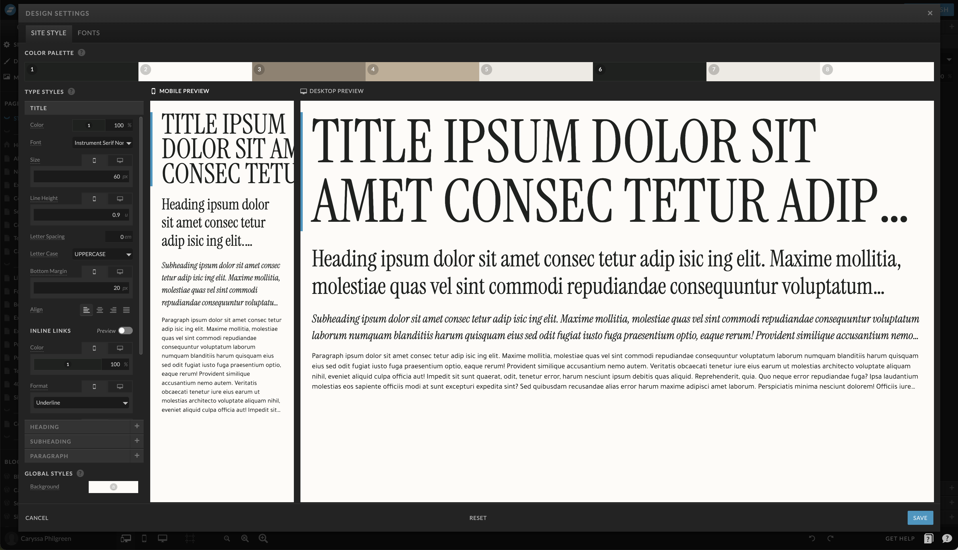
Step 1: Enter Your Brand Colors
First, let’s enter your brand colors. You might have these saved as hex codes (those six-character codes that define specific colors). If not, you can easily find them from your brand’s materials or branding guidelines.
Before getting started, it’s important to understand that all website templates follow a color system of some sort. The following system used in all of my website templates makes it simple to manage and change your website’s colors while keeping everything looking beautiful and cohesive.
- Dark Text on Light Backgrounds: Start with the number one spot, which represents dark text on light backgrounds. For this, choose a dark color. Charcoal or a shade of black is an excellent option for this spot.
- Light Text on Dark Backgrounds: Move to the number two spot, which should be your lightest color, as it will be used for any light text on dark backgrounds.
- Splash Color (Links and Buttons): For the number three spot, your “splash color” for links and buttons, choose a saturated or more vibrant color from your brand.
- Secondary Colors: Choose one of your secondary colors.
- Secondary Colors: Choose another one of your secondary colors.
- Dark Background Color: Number six should be your darkest color. You can even use the same color as number one here.
- Light Background Color (Shade of White): For number seven, pick a light color like ivory or a shade of white. This will be used as any light colored backgrounds.
- Lightest Background Color (White or Off-White): Number eight should be your lightest color and can match number two.
Step 2: Setting up your Fonts
Adding Your Own Fonts
Click the “Fonts” tab from the top of the Design Settings window. You’ll notice that Showit allows you to add any Google fonts to your website for free. If you have a specific Google font in mind, you can find it in the dropdown list. But to more easily explore the Google fonts to choose from, click the blue “Google Fonts” to search for the perfect free font. Once you’ve picked out the fonts you’d like to be able to use on your website, select them from the drop down in Showit and click “Add Google Font”. You’ll then see it in your list of fonts on the right side.
You can also upload custom fonts to your website. Click here to read the blog post explaining exactly how to add a custom font to your Showit website.
Customizing Font Styles
Now that you have your fonts loaded, it’s time to set up your type styles.
- Choose the “Site Style” tab from the top of the Design Settings menu in your Showit builder.
- Then, click on the Title type style.
- Select your preferred font from the dropdown menu on the left side of the window. Make sure the font change is reflected both on desktop and mobile.
- Repeat for each type style (there are four total: Title, Heading, Subheading and Paragraph).
Don’t mess too much with the sizing or spacing of the type style. Doing so may drastically impact how the text looks on your website, leading you to have to make numerous adjustments throughout the site to accommodate for the larger or smaller area of text.
Step 3: Save, Observe & Adjust
With all your colors and fonts in place, click “Save.” You’ll see how these design adjustments transform your website design.
Checking & Adjusting Colors:
The magic of the color system will become clear, and when you stick to it, your website will maintain a consistent and appealing look. Look through each page, watching for color contrast issues. If you’re having difficulty seeing the text on background as a whole, you may need to tweak the Design Settings to accommodate the coloring make-up of the website template.
Checking & Adjusting Fonts:
Keep an eye out for any overlapping or spacing issues with the text. If you encounter any issues with text overlapping, adjust the font size or spacing within Showit’s site-wide Design Settings. Remember, consistency is key in creating a visually appealing website that represents your beauty brand.
So there you have it! It is easy to set up your colors and fonts on Showit when you follow this simple system. Keep your website looking professional and cohesive by adhering to these guidelines. Happy website building!
Your first step to a website you deserve. Download now and let us walk you through the baby steps (yes even the scary techy stuff!).
The 5 Steps to a Confident Website
Other Free Resources

