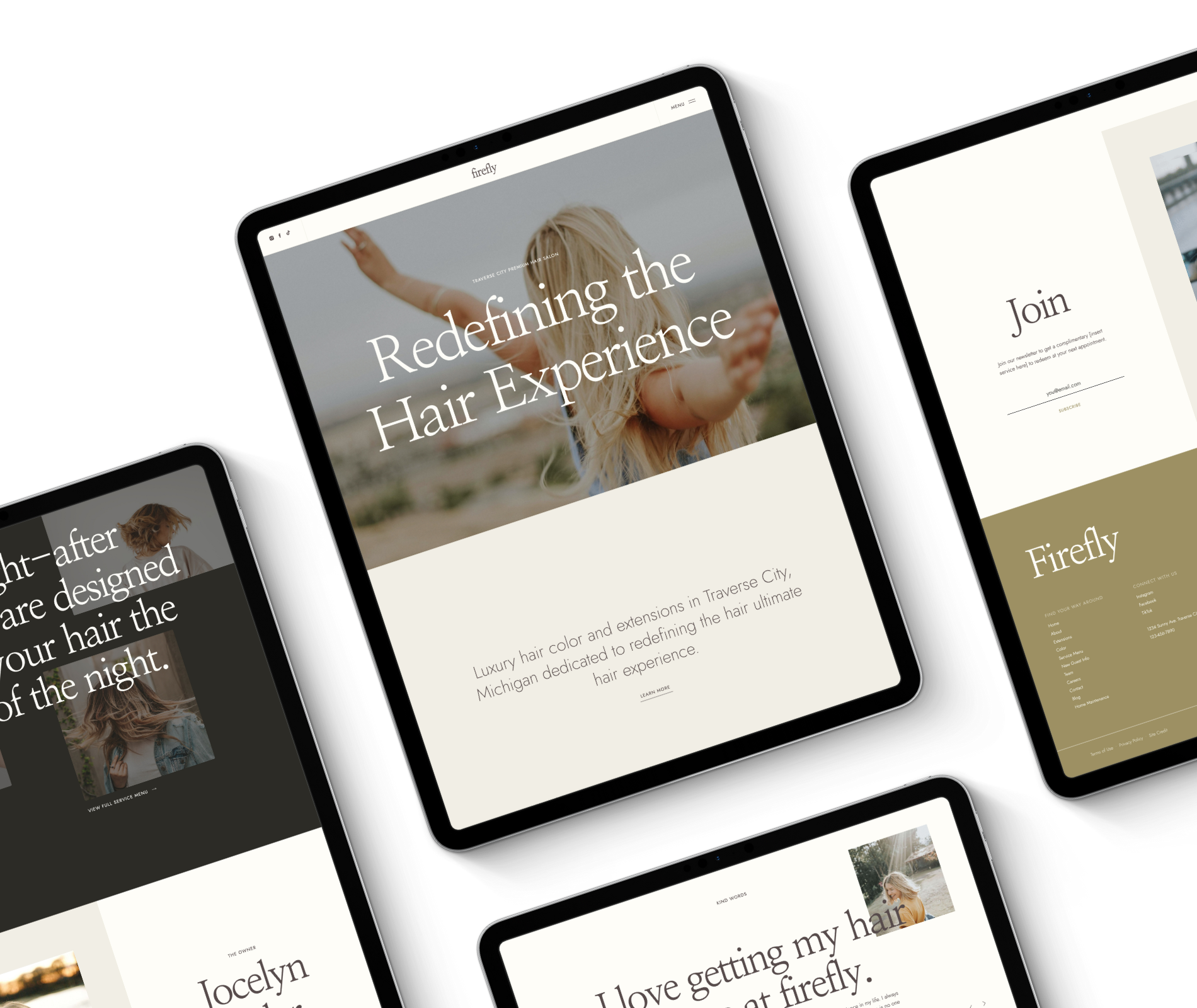
For those who are not tech-savvy, it can feel daunting to confidently choose the right Showit website template for you. The good news is that picking the right template for your salon or stylist business doesn’t have to be a nerve-wracking experience. In this post, we will walk you through the key factors to consider when selecting a website template, empowering you to make an informed investment decision without feeling overwhelmed.
1. Ignore Colors, Fonts, and Photo Aesthetics
When browsing through website templates, it’s easy to get caught up in the visuals, such as colors, fonts, and photo aesthetic. While these elements contribute to the overall look and feel of your website, they can be easily customized to make it fit YOUR vibe. Focus instead on the structure and layout of the template. Consider how the content is organized and whether it aligns with the content you’ll need to communicate through your website.
2. Pay Close Attention to the Overall Layout
The layout of your website is crucial to ensure a seamless user experience. Look for a template that presents your content in a clear and organized manner. Consider the following:
- Navigation: Ensure the template has an intuitive and user-friendly navigation menu that will help YOUR ideal guests find the information they need easily.
- Content Blocks: Check if the template provides suitable sections to showcase your services, portfolio, contact information, and any other crucial details.
Remember, altering the layout significantly after choosing a template can lead to a messy and unprofessional appearance. Instead, select one that fits your content and functionality requirements from the start to ensure a polished and beautiful end result with zero-no headaches along the way.
3. Consider Your Business Goals
Before selecting a template, think about your long-term business goals. If you’re an independent stylist with no immediate plans for expansion, a more straightforward template (like our Lite template versions) might serve your needs. However, if you’re a salon or stylist with ambitious growth plans, opt for a Full template that can accommodate future expansions and updates. Although you might not utilize all these functions right away, having the flexibility to grow and adapt as your business evolves will save you time and money later on.
4. Image Frames
Visual aesthetics play a significant role in creating a compelling website. One aspect to consider is the style of image frames used in the template. Some templates may have soft, rounded photo frames, while others may use sharp, straight corners. Choose the one that best aligns with your brand’s personality and the overall vibe you want to convey.


Conclusion
It doesn’t have to be intimidating to confidently choose the right Showit website template for your salon or stylist brand. By focusing on essential elements such as layout, future scalability, and image frames, you can confidently make an informed decision that best represents your brand. Remember colors, fonts, and photo aesthetics can be easily customized later. The structure and functionality of the template are more difficult to change without compromising the polished look of your website. Take the time to research and explore various templates before making your choice. That way, your online presence will be off to a strong and impactful start. Happy website building!
Your first step to a website you deserve. Download now and let us walk you through the baby steps (yes even the scary techy stuff!).
The 5 Steps to a Confident Website
Other Free Resources
