You’re a busy stylist, always serving your guests and giving them their dream hair. But have you really considered your guests’ first impression of your client experience from the moment they “step foot” on your website? Let’s face it, most of your guests will be finding you on their phone. It’s one of the most common questions I get. “How will my website look on my phone?” Our phones dominate our lives these days, and it’s crucial to have the ability to make mobile-friendly websites for stylists. Don’t worry if you’re not tech-savvy—Showit is the perfect tool to effortlessly create a stunning, mobile-friendly website for your salon.
What is Showit?
Showit is a user-friendly website builder specifically designed for creative professionals like salon owners and independent stylists. It’s a powerful platform that allows you to create visually captivating websites without the need for coding or technical expertise. With Showit, you can easily customize templates and design every aspect of your website to reflect your salon’s unique brand.
Easy Mobile Navigation and User Experience:
As a stylist, it’s essential to provide an exceptional user experience for your clients, and that starts with a mobile-friendly website. Over half of all website traffic comes from mobile devices. By optimizing your website for mobile, you ensure that your clients can access your services anytime, anywhere. Showit understands this importance and ensures a seamless mobile experience for your visitors.
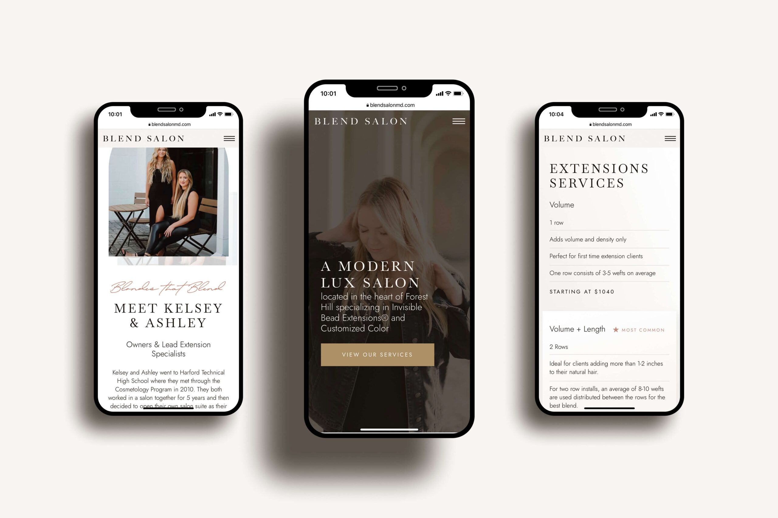
Mobile Editor:
One of the standout features of Showit is its mobile website editor, which works seamlessly alongside the desktop website editor. This powerful tool allows you to create a separate mobile design that specifically appeals to the people visiting your website from their cell phone. With Showit’s mobile editor, you can easily customize anything. The layout, fonts, images, and other elements can be edited specifically for small screens. This will ensure a captivating mobile experience for your salon’s visitors. This means that you have full control over the design and functionality of your website on both desktop and mobile, empowering you to create a cohesive and visually stunning online presence across all devices. Showit’s mobile editor takes away the complexity of creating a separate mobile design, making it accessible and user-friendly even for those who are not tech-savvy.

Final Thoughts:
Having mobile-friendly websites for stylists is not just a trend; it’s a necessity. Showit provides you with the tools and flexibility to create a visually captivating and mobile-friendly website without the need for technical expertise. Therefore, your salon’s website will shine on every smartphone, captivating dream guests and driving your business’ growth.
Your first step to a website you deserve. Download now and let us walk you through the baby steps (yes even the scary techy stuff!).
The 5 Steps to a Confident Website
Other Free Resources

